How Market Research Is Conducted A Practical Guide
Discover how market research is conducted with actionable strategies and real-world examples. Learn modern methods to turn data into business decisions.
Effective market research isn't just about collecting data; it's a structured process designed to mitigate risk and guide smart business decisions. It starts with a clear, well-defined business problem, moves into data collection using both secondary (what's already out there) and primary (newly gathered) sources, and finishes with sharp analysis that turns raw information into a strategic advantage. This whole endeavor is about replacing assumptions with evidence.
Defining Your North Star: What to Solve Before You Start

The success or failure of your market research is often decided before a single survey goes out the door. It all comes down to how well you define the problem you're trying to solve. Without a razor-sharp objective, research can quickly devolve into a costly, aimless exercise instead of a powerful tool for making a decision.
Too many projects start with a question that’s far too broad. "Should we enter the European market?" isn't a research question; it's a massive business decision. To get a real answer, you need to break that huge question down into smaller, more manageable pieces.
From Vague Problems to Sharp Questions
The real work here is translating a broad business challenge into a set of specific, answerable questions. Think of this step as a filter. It ensures every dollar and hour you spend from this point on is focused and relevant.
Let’s take that vague "European expansion" idea. A seasoned researcher would deconstruct it into targeted inquiries like these:
- Market Opportunity: What’s the total addressable market (TAM) for our product in, say, Germany and France? What does the projected 5-year growth rate look like?
- Competitive Landscape: Who are the top three local competitors we’d face, and how does their value proposition stack up against ours in the eyes of local customers?
- Customer Behavior: What actually drives purchasing decisions for B2B software buyers in the German tech sector? Which channels do they rely on for information?
- Pricing and Viability: What’s the going rate for similar solutions, and what’s the actual willingness to pay among our ideal customer profile in that region?
This is how you get things done. You transform an overwhelming goal into a series of clear, distinct investigations.
A problem well-stated is a problem half-solved. From my experience, rushing this initial step is the single biggest reason research projects fail to deliver anything truly actionable. Get your stakeholders in a room and hammer out these questions with surgical precision.
Linking Objectives to Business Outcomes
Once your questions are sharp, the next step is to connect each one to a specific business outcome. This is what separates interesting data from instrumental insights. If you can't draw a straight line from an insight to a decision, you need to refine the research objective.
Here’s what that connection looks like in practice:
- Research Objective: Determine the market size and growth in Germany.
- Business Outcome: Justify the $500,000 budget request for market entry.
- Research Objective: Identify the top three pain points of our target customers.
- Business Outcome: Finalize the Q3 product roadmap and prioritize feature development.
- Research Objective: Analyze competitor pricing models.
- Business Outcome: Set a competitive—and profitable—launch price for our new service tier.
When you frame your research plan this way, you create a clear line of sight from the work being done to the impact it will have. It keeps the project on track and makes it much easier to get the buy-in and resources you need from leadership. Your final report won’t just be a deck full of charts; it will be a set of clear recommendations tied to goals everyone already agreed on.
Digging for Gold: Kicking Things Off with Secondary Research
Before you even think about writing a survey or booking a focus group, you need to realize that a huge amount of valuable information is probably already out there, just waiting to be found. This is the world of secondary research: the art of finding and piecing together data that someone else has already done the hard work of collecting.
Frankly, any smart team starts here. It's the fastest, most cost-effective way to get a solid grasp of a market, a competitor, or a customer trend without starting from scratch. You're essentially building on the work of industry analysts, government bodies, and academics to get up to speed quickly. Think of it as scouting the terrain before you draw the battle plan.
Where to Find the Good Stuff: Public and Commercial Data
The internet is an ocean of information, and it's easy to drown in it. The real skill is knowing exactly where to look for credible data that directly addresses your big questions about market size, who the key players are, and what customers are actually doing.
I find it helps to organize the hunt by source type. This ensures you cover all your bases and don't miss a critical angle.
Here’s where I typically start:
- Industry Reports: Big names like Gartner, Forrester, and IBISWorld are the bread and butter. They offer incredibly detailed analyses of specific industries, complete with market size figures, growth projections, and competitive teardowns. Yes, they're often pricey, but you'd be surprised what you can glean from their freely available executive summaries.
- Government Databases: Don't sleep on these. Sources like the U.S. Census Bureau or the Bureau of Labor Statistics are absolute goldmines for demographic and economic data. The information is rock-solid, reliable, and almost always free.
- Academic Journals: For more nuanced questions about consumer psychology or emerging tech, I turn to platforms like Google Scholar or JSTOR. The research is rigorous, but be prepared to wade through some dense academic language to find the gems.
- Company Filings: This is a must for competitive intelligence. Public companies have to file detailed reports (like 10-Ks) with the SEC. These documents are packed with information on performance, strategy, and what they see as major market risks.
The field itself is booming for a reason. The global market research services industry grew from $81.13 billion in 2022 to $83.93 billion in 2023 and is on track to hit $95.49 billion by 2027. This isn't just about old-school methods; it's a reflection of how modern business research methods blend classic techniques with new data streams to drive decisions.
Making Sense of It All: Validating and Weaving a Narrative
Finding a stat is easy. Knowing if you can trust it is the hard part.
A critical eye is your most important tool here. Not all sources are created equal, and your job is to separate the signal from the noise. A great secondary research report isn't a massive data dump; it's a carefully curated set of validated insights that tell a clear story.
As you evaluate each source, you have to play detective. Ask yourself:
- Who's behind this? Is it a respected research firm with a transparent methodology, or a company blog with a clear agenda?
- How old is this? Market data gets stale, fast. A report from 2018 might be interesting for historical context, but it's likely useless for making a decision today.
- How did they get their numbers? What was the methodology? A survey with a tiny sample size of 50 people is nowhere near as reliable as one that polled 5,000.
Never, ever hang your hat on a single data point. The real magic of secondary research happens in the synthesis—connecting the dots between multiple, credible sources to build a coherent picture. If three different analyst reports estimate the market is growing around 15% a year, you can feel pretty confident about that number.
This is how you start to paint a rich, multi-dimensional portrait of the market. You might pull revenue figures from a competitor's annual report, layer in customer satisfaction data from an industry survey, and add market share estimates from an analyst brief. Suddenly, you have a view of your competition that no single source could ever provide. This groundwork is absolutely essential for making smart, informed decisions without breaking the bank.
Choosing Your Tools for Primary Research
After digging through all the existing data, you'll sometimes hit a wall. Key questions are still unanswered. This is your cue to shift into primary research—the hands-on work of gathering fresh insights directly from your target audience. It’s where you graduate from understanding the market landscape to truly understanding the people in it.
The real skill here isn't just picking a method; it's about selecting the right tool for the job. You're dealing with two fundamentally different approaches: quantitative and qualitative research. Each one is built to answer a very different kind of question, and knowing when to use which is what separates effective research from a wasted budget.
This decision tree gives you a simple mental model for that initial fork in the road.
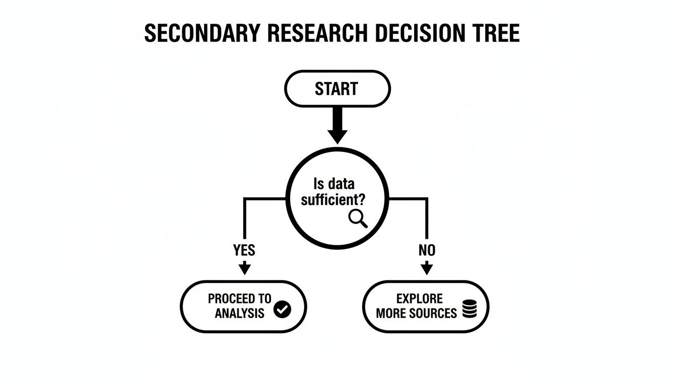
As the flowchart shows, if you’ve got what you need from secondary sources, great—jump straight into analysis. If not, it's time to roll up your sleeves and start talking to people.
Sizing Up the Market with Quantitative Research
Quantitative research is all about the numbers. This is the approach you take when you need to answer "how many," "how much," or "how often." The goal is to collect structured data from a large sample, which allows you to run statistical analysis, validate your hunches, and spot trends across a broad audience.
Let's say a startup is about to launch a new project management tool. They could run a survey with 1,000 potential users, asking them to rank their most-needed features. When the data comes back showing "72% ranked 'AI-powered scheduling' as a top-three feature," the product team gets a clear, defensible signal. That's quantitative research doing its job.
The undisputed champion in this arena is the online survey. In fact, a staggering 85% of research professionals use them regularly, making them central to how modern market research is conducted. They blow other methods like mobile surveys (47%) and proprietary panels (32%) out of the water, a testament to a massive industry shift toward digital efficiency. You can dig deeper into these market research statistics to see just how dominant this trend has become.
Pro Tip: Always design your surveys backward from the decision you need to make. For every single question you write, force yourself to answer, "What action will this data drive?" If you can't come up with a concrete answer, kill the question.
Uncovering the 'Why' with Qualitative Research
While quantitative data tells you what is happening, qualitative research gets to the why. It’s an exploratory approach, designed to pull rich, nuanced insights from a much smaller group of people. This is how you understand the motivations, perceptions, and gut feelings that numbers simply can't capture.
Common methods here are in-depth interviews and focus groups. Picture a software company that sees a huge user drop-off during their onboarding process—their analytics flag the problem, but offer zero explanation.
To get to the "why," they might sit down for one-on-one interviews with five users who recently bailed. In those conversations, they could discover that a key button is horribly mislabeled, a critical insight they never would have found by staring at a dashboard. That’s the magic of qualitative work.
- In-Depth Interviews (IDIs): These are one-on-one conversations that let you go deep into someone’s personal experience. They’re perfect for sensitive topics or when you need detailed, individual stories.
- Focus Groups: A moderated chat with a small group of people (usually 6-10). These are fantastic for brainstorming new ideas and seeing how group dynamics shape opinions on a concept or product.
To get a clearer sense of which tool fits which job, it's helpful to see them side-by-side.
Comparing Primary Research Methods
| Method | Type | Best For | Typical Sample Size | Insight Type |
|---|---|---|---|---|
| Online Surveys | Quantitative | Validating hypotheses; measuring market size & sentiment. | 100 - 1,000+ | Statistical data; trends; correlations. |
| In-Depth Interviews | Qualitative | Exploring complex motivations; getting user stories. | 5 - 15 | Deep, nuanced understanding of individual perspectives. |
| Focus Groups | Qualitative | Brainstorming ideas; testing concepts; observing group dynamics. | 6 - 10 per group | Reactions and social influence on opinions. |
| A/B Testing | Quantitative | Optimizing a specific variable (e.g., headline, button color). | 1,000+ per variant | Causal relationships; performance metrics. |
| Ethnographic Studies | Qualitative | Understanding user behavior in their natural environment. | 3 - 10 | Contextual, behavioral insights. |
Each method offers a unique lens, and the best researchers know how to pick the right one—or combine them—to get the clearest possible picture.
Blending Methods for a Complete Picture
The most powerful research rarely forces an "either/or" choice between quant and qual. The savviest teams strategically combine them. This hybrid approach, often called mixed-methods research, gives you a view that is both statistically robust and full of human context.
A common workflow looks something like this:
- Start with Qualitative: You might run a handful of in-depth interviews to explore a new product idea. These conversations help you uncover the actual language customers use, their real pain points, and any hidden concerns.
- Build a Quantitative Survey: Armed with those qualitative insights, you can now design a sharp, relevant survey. This lets you test the hypotheses that emerged from your interviews across a much larger, statistically significant sample.
- Analyze and Synthesize: The final step is weaving the two datasets together into a single story. The survey might tell you that 65% of users are worried about data privacy. The interview quotes bring that number to life by explaining exactly what those fears sound like in your customers' own words.
By combining the strengths of both, you move beyond just collecting data points. You start building genuine empathy for your customers while also gathering the hard evidence you need to make confident, strategic moves. This integrated view is a hallmark of how market research is conducted at the highest level.
Finding the Story in Your Data
Collecting data is just the first step. You've done the hard work of mining the ore, but the raw material isn't the treasure. The real value comes from turning those messy spreadsheets and pages of interview notes into a clear, compelling story that tells you exactly what to do next.
This is where many projects fall flat. Teams get bogged down, drowning in data without a clear process to make sense of it all. The trick is to treat your quantitative and qualitative findings differently but bring them together in the end. Your goal is to build a single, coherent narrative that answers your biggest business questions.
Cleaning and Visualizing Quantitative Data
Before you can spot a single trend in your survey results, you have to clean the data. This part is non-negotiable. Data cleaning is the process of systematically fixing or getting rid of inaccurate, incomplete, or just plain wrong records from your dataset.
Think of it as prepping your ingredients before you start cooking. It isn't glamorous, but skipping it guarantees a disaster.
Common data cleaning tasks usually include:
- Ditching duplicates: Making sure every person or data point is only counted once.
- Fixing structural errors: Catching typos and standardizing labels (e.g., making "USA," "U.S.," and "United States" all the same).
- Handling the blanks: Deciding what to do with missing values—do you remove the whole entry or fill it in logically?
- Filtering out the noise: Removing survey responses from people who don't actually fit your target audience.
Once your data is squeaky clean, the fun begins. While you can run complex statistical tests, the fastest way to see what's going on is through data visualization. Charts and graphs have a way of making abstract numbers feel tangible, turning trends into shapes you can immediately grasp.
A simple bar chart, for instance, can instantly show you that 78% of a key segment is crying out for a specific feature. A line graph might reveal a worrying seasonal dip in engagement you never knew you had. These visuals aren't just for the final presentation deck; they are powerful analytical tools.
Never underestimate the power of a simple scatter plot. It can reveal correlations between two variables—like price sensitivity and company size—that you’d completely miss by just staring at rows of numbers. This is a fundamental part of how market research is conducted effectively.
Uncovering Themes in Qualitative Data
Qualitative data from interviews and focus groups is a different beast entirely. It doesn't fit into neat charts because it's made up of rich stories, opinions, and emotions. Your goal here isn't to count things, but to find meaning. The go-to method for this is thematic analysis.
This is really just a structured way of identifying, analyzing, and reporting on patterns (or themes) within all that text. It's less about fancy software and more about focused, critical thinking.
Here’s a practical way to approach it:
- Get familiar. First, just read through all your interview transcripts and notes. And then read them again. You need to get a feel for the full scope of the conversations before you start dissecting them.
- Start coding. Now, go through the data line-by-line and attach short labels, or "codes," to interesting statements. A customer saying, "The setup process was a nightmare," could be coded as "Onboarding Friction."
- Hunt for themes. Begin grouping your individual codes into bigger, potential themes. Codes like "Onboarding Friction," "Confusing UI," and "Lack of Tutorials" could all fall under a broader theme like "Poor User Experience."
- Review the themes. Step back and look at your themes. Do they really represent the data? Some might need to be merged, others split apart, and some might just be red herrings you need to discard.
- Define and name them. Solidify each theme with a clear definition and a sharp, concise name. This ensures everyone on your team knows exactly what "Poor User Experience" really means based on the data.
This structured process keeps you from just cherry-picking quotes that support your own assumptions. It forces you to honestly engage with everything your customers told you.
Synthesizing and Avoiding Analytical Traps
The final, and most crucial, step is synthesis. This is where you weave your quantitative and qualitative insights into a single, cohesive story. You’re connecting the "what" from your surveys with the "why" from your interviews.
For example, your quantitative data might show a certain feature has shockingly low usage. But then your interviews reveal the "why": users either don't know what it does or can't even find it in the interface. Suddenly, you have a complete story: the feature isn't unpopular, it's undiscoverable.
As powerful as this is, it’s also where human bias can creep in. The most dangerous trap is confirmation bias—our natural tendency to look for evidence that proves what we already believe. If you’re convinced your new product idea is a winner, you might unconsciously fixate on the one person who loved it and downplay the four who were utterly confused.
To keep yourself honest:
- Appoint a devil's advocate. Ask someone on your team to actively challenge your interpretations. Their job is to find the holes in your story.
- Triangulate your data. Never, ever rely on a single data point. The most reliable insights are the ones that surface across multiple sources—surveys, interviews, and your secondary research.
- State your assumptions upfront. Before you even look at the results, write down your hypotheses. This makes you hyper-aware of your own biases as you go through the analysis.
By staying objective and systematically tying all your data together, you can build a narrative that isn't just compelling, but is a trustworthy foundation for making those big, high-stakes decisions.
Communicating Findings That Drive Action

Even the most bulletproof analysis will gather dust if you can't communicate it effectively. The final, and arguably most critical, phase of any research project is translating your findings into a clear, compelling narrative that forces stakeholders to sit up, listen, and—most importantly—act. Your data needs to tell a story that's sharp, relevant, and impossible to ignore.
A brilliant insight buried on slide 47 is a wasted insight. Your goal isn’t just to inform; it’s to persuade. This means moving beyond a simple data dump and carefully architecting your communication to guide the audience from understanding the "what" to committing to the "so what."
Structuring Your Report for Maximum Impact
The structure of your report is just as important as the data inside it. A logical flow helps your audience absorb complex information without getting lost in the weeds. Think of it as building a case, piece by piece, leading to an inescapable conclusion.
Always start with the most critical information. Stakeholders are busy, and their attention is your most precious resource. Every effective report I've ever built begins with a punchy executive summary. Get the core findings and key recommendations right upfront.
From there, the rest of the report should flow naturally:
- Background and Objectives: A quick refresher on the business problem we set out to solve. This anchors the results back to the original goals.
- Key Findings: This is the heart of your story. Present the most significant insights, supported by clean, powerful data visualizations.
- Actionable Recommendations: This is where you earn your keep. Go from "what the data says" to "what we should do about it." Each recommendation must be specific, concrete, and directly tied to a key finding.
- Appendix: This is the home for all the supporting details—crosstabs, detailed data tables, survey instruments, and methodological notes. It keeps the main report clean while providing transparency for anyone who wants to dig deeper.
This structure respects your audience's time and ensures the most important messages land with clarity and force.
The Power of Data Visualization
Numbers on a page are abstract; a well-designed chart tells a story. Good data visualization is your single best tool for making complex information instantly understandable to anyone, from the data scientists in the room to the C-suite.
The trick is to choose the right visual for the story you're telling. Please, don't just default to a pie chart for everything.
I see this all the time: people cramming way too much information into a single chart. The goal isn't to show all the data; it's to highlight the most important insight. If a chart requires a five-minute explanation, it has failed. Each visual should make a single, powerful point in a matter of seconds.
Here are a few go-to choices for common scenarios:
- Comparing categories? A simple bar chart is almost always the answer. It's perfect for showing which customer segment is most profitable or which marketing channel drives the most leads.
- Showing a trend over time? A line chart is your best friend. It clearly illustrates growth, decline, or seasonality for metrics like sales or website traffic.
- Revealing relationships? A scatter plot can uncover fascinating correlations between two variables, like the connection between pricing and customer satisfaction scores.
By choosing the right chart, you make your data accessible and memorable, ensuring your insights stick around long after the presentation ends.
Tailoring Your Message to the Audience
Finally, remember that not all stakeholders speak the same language or need the same level of detail. How you present findings to your product team should be worlds away from your presentation to the board.
For a technical audience, feel free to dive into the methodology and statistical significance. For executives, you need to zoom out. Focus on the high-level implications: the size of the market opportunity, the urgency of a competitive threat, or the bottom-line impact of your recommendations. For those moments when you need to move fast, a tool like StatsHub.ai can deliver slide-ready visuals and summaries, helping you quickly adapt your report for different teams.
By mastering the art of communication, you ensure your research doesn't just become another file on a server. It becomes a catalyst for smart, confident decisions that move the business forward.
Answering the Tough Questions About Market Research
Even the most well-laid research plan runs into practical questions. Let's be honest, stakeholders want to know about cost, timelines, and whether this whole thing is even worth it. Getting ahead of these common queries helps everyone feel more confident and sets the right expectations from day one.
Here are some of the questions I hear all the time.
How Much Does Professional Market Research Typically Cost?
There's no simple answer here—it really depends on what you're trying to accomplish. Think of it less like buying a product off the shelf and more like commissioning a custom project. The cost is tied directly to the scope and difficulty of the work.
A quick online survey targeting a general audience might only set you back a few thousand dollars. But if you're planning an international study with multiple focus groups and in-depth interviews with hard-to-reach executives, you're looking at a project that can easily climb into the six-figure range.
The big variables that drive the price up are:
- Methodology: Face-to-face qualitative work is almost always more expensive than a straightforward online survey.
- Audience Rarity: The more niche your audience, the more it costs to find and incentivize them. Recruiting surgeons is a lot pricier than recruiting college students.
- Timeline: Need it yesterday? Expect to pay a premium for expedited work.
This is a classic "you get what you pay for" situation. Scrappy, DIY research is great for getting a quick gut check, but when you're making a big strategic bet, investing in professionally run research is non-negotiable.
How Long Does a Typical Market Research Project Take?
Good research takes time. A full-blown project, from the initial kickoff meeting to delivering the final report, usually falls somewhere in the 4 to 12 week range. That timeline gives you enough breathing room for proper planning, instrument design, fieldwork, deep analysis, and thoughtful reporting.
But not everything moves at that pace. You can often wrap up secondary research in just a few days. And now, technology is changing the game. AI-powered platforms can pull together comprehensive market reports in minutes, which is a massive shortcut for getting foundational data without the traditional wait.
What Is the Difference Between Market Research and Market Analysis?
I see people use these terms interchangeably all the time, but they're two distinct—and equally important—parts of the process.
It helps to think of it like this: market research is about gathering the facts, while market analysis is about figuring out what those facts mean.
- Market Research: This is the what. It's the hands-on work of deploying surveys, running interviews, and digging through data to understand your customers and the competitive landscape.
- Market Analysis: This is the so what. It's the strategic layer where you interpret the findings to spot opportunities, flag risks, and recommend a clear path forward for the business.
You can't have one without the other. Solid research provides the raw material, but it's the analysis that turns that material into a strategic asset.
Can I Conduct Effective Market Research on a Small Budget?
Absolutely. A tight budget just means you have to get creative and resourceful. You don't have to operate in the dark just because you don't have a six-figure budget to play with.
Start by wringing every last drop of insight out of free secondary sources—think government data, industry publications, and trade association reports. For your own data collection, tools like Google Forms or a basic SurveyMonkey plan can get you surprisingly far. Combine that with a handful of informal coffee chats with potential customers, and you'll have a solid, low-cost foundation for making much smarter decisions.
Need a credible market snapshot without the high cost and long wait? StatsHub.ai delivers a comprehensive, slide-ready market report in minutes for just $15, giving you the essential data you need to make confident decisions today. Get your instant market report.
Ready to move faster?
Generate a market report in minutes, not weeks.
$49, easy to share, and ready for your team.