How to Analyze Market Trends for Smarter Business Decisions
Learn how to analyze market trends with this actionable guide. Master data sourcing, quantitative analysis, and data storytelling to drive confident decisions.

Before you even open a spreadsheet or fire up a BI tool, the most critical part of any market trend analysis happens. This upfront work is what separates actionable intelligence from a mountain of useless data. It’s about building a solid foundation so you're not just collecting numbers, but actively seeking answers to important business questions.
Get this part right, and you'll avoid the dreaded "analysis paralysis."
Setting the Stage for Effective Trend Analysis
Think of this initial phase as drawing a map before you start your journey. Without it, you're just wandering. A well-defined plan turns raw data from a potential distraction into a focused tool for making smarter, faster decisions.
Frame the Right Business Questions
The entire analysis hinges on the questions you ask at the beginning. A vague question like "What's trending?" will get you a vague, unhelpful answer. You need to be specific and tie your questions directly to a business outcome.
Here are a few examples of what I mean:
- For Market Entry: "What's the five-year growth forecast for the U.S. wearable fitness tech market, and who are the top three players we'd be up against?"
- For Competitive Benchmarking: "How has our main competitor changed their pricing over the last 24 months, and did it actually help them get more customers?"
- For Demand Forecasting: "Looking at last year's sales and current search trends, what's our projected demand for eco-friendly packaging in Q4?"
Nailing these kinds of questions is a core skill. If you want to sharpen your ability to formulate them, digging into the fundamentals of marketing data analysis is a great place to start.
The process flows from your high-level questions down to the specific metrics you need to track.
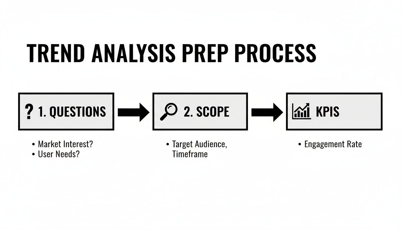
As you can see, your business questions dictate the scope, which then tells you exactly which KPIs you need to monitor.
Define Your Scope and Time Horizon
With a sharp question in hand, the next step is to draw the lines. What are the boundaries of your analysis? Are you investigating a short-term fad or a long-term strategic shift? The difference is massive. A sudden spike in TikTok interest for a niche product is a fad. The steady, year-over-year growth in consumer spending on sustainable goods is a long-term shift.
Be crystal clear on your scope:
- Time Period: Are you looking at the last quarter, the past year, or a five-year window?
- Geography: Is this analysis focused on a single city, a country like Germany, or a global region like Southeast Asia?
- Industry Segment: Are you analyzing the entire automotive industry or narrowing in on just the electric vehicle (EV) charging infrastructure sector?
To ensure your analysis remains focused and delivers value, it's essential to define these core components upfront. The table below outlines the key questions to answer for each part of your framework.
Core Components of a Trend Analysis Framework
| Framework Component | Key Question to Answer | Example Application |
|---|---|---|
| Business Question | What specific decision will this analysis inform? | "Should we launch our new SaaS product in the UK market next year?" |
| Time Horizon | What is the relevant timeframe for this trend? | "Analyze market data from the last 3 years to forecast the next 2." |
| Geographic Scope | Where are we looking? | "Focus exclusively on urban centers within the United Kingdom." |
| Segment/Niche | What specific part of the market matters? | "Target small to medium-sized businesses (SMBs) in the retail sector." |
| Key KPIs | How will we measure success or change? | "Track market size, CAGR, and competitor market share." |
Thinking through these elements prevents you from "boiling the ocean" and ensures the insights you deliver are targeted and relevant to your stakeholders.
Identify KPIs That Truly Matter
Finally, pick the metrics that will directly answer your initial question. This is where many people go wrong, getting distracted by vanity metrics like raw website traffic. Instead, focus on indicators that reflect the real health of the market and your business's position in it.
Some essential KPIs often include:
- Market Size and Growth Rate: The total addressable market (TAM) and how fast it’s expanding.
- Compound Annual Growth Rate (CAGR): A smoothed-out growth metric that shows the annual rate over a specific period.
- Customer Acquisition Cost (CAC): The real cost to bring in one new customer.
- Share of Voice (SOV): How visible your brand is compared to the competition.
Choosing the right KPIs from the outset ensures every piece of data you collect serves a purpose, getting you to a conclusive answer much more efficiently.
Finding and Validating High-Quality Market Data
Let’s be honest: your entire analysis is only as good as the data you feed it. Garbage in, garbage out. If you start with faulty numbers, you'll end up with a strategy built on guesswork, and nobody wants that. Sourcing reliable information isn’t just a step in the process; it’s the foundation for everything that follows.
The goal isn't just to hoard data. It's about finding the right data from multiple, credible sources. This is your best defense against the biases and inaccuracies that are lurking everywhere.

Where to Look: Primary vs. Secondary Sources
Your data hunt will essentially take you down two paths. The most common starting point is secondary data—information that someone else has already done the hard work of collecting. It’s efficient and gives you a broad view of the landscape.
You can find solid secondary data from places like:
- Government Databases: Think of the Bureau of Labor Statistics or the U.S. Census Bureau. They offer a goldmine of macroeconomic and demographic data that's usually free and impartial.
- Industry Reports: Market research firms like Gartner and Forrester produce incredibly detailed reports on specific sectors. They come at a premium, but the depth of analysis is often worth it.
- Academic Institutions: Universities are constantly publishing studies on emerging trends and consumer behavior. A quick search on Google Scholar can uncover some real gems.
Then there's primary data, which is information you gather yourself to answer a very specific question. It’s more work, for sure, but it gives you insights that your competitors won't have. This could be anything from running customer surveys and focus groups to conducting direct interviews or just listening to raw, unfiltered conversations on social media.
The Art of Triangulation and Validation
You're going to find conflicting data. It’s inevitable. One report will project massive growth while another predicts a downturn. Don't panic; this is normal. It's precisely why you can never, ever rely on a single source.
When you hit these contradictions, put on your detective hat and ask a few critical questions:
- Who paid for this research? A study funded by an industry group will likely have a rosy outlook. Be skeptical.
- What was the methodology? Look for the sample size. An online poll of 100 people is interesting, but it's not as reliable as a rigorous study with 10,000 participants.
- How old is this data? In a fast-moving market, a report from two years ago might as well be from another century.
For instance, a good top-down analysis might start with global trade volumes, which reportedly hit a record $35 trillion in 2025, a 7% jump from the prior year. This kind of macro indicator is fantastic for framing your analysis, as it shows fundamental economic shifts. For consultants and investors, this is how you can pressure-test a company's growth story against what's actually happening in the world. You can dig into data like this in the latest UNCTAD global trade report.
The best analysts I know act like investigative journalists. They treat every number with a healthy dose of skepticism until they can back it up with at least two other independent sources. This triangulation is what separates a flimsy analysis from a rock-solid, defensible one.
Using Modern Tools to Get Ahead
Manually digging through reports and vetting every number can easily eat up weeks of your time. This is where you can get a serious edge. The goal is to flip the classic 80/20 rule—instead of spending 80% of your time just finding data, you should be spending 80% of your time figuring out what it means.
Platforms like StatsHub.ai were built to solve this exact bottleneck. They pull together massive amounts of data from pre-vetted sources, handle the initial validation, and serve it up in a structured, slide-ready format. You can get a comprehensive snapshot of a market—its size, growth, segments, and key players—in minutes.
This approach gives you a huge head start. You get a reliable baseline to build from, which frees you to focus on the high-value work: connecting the dots, spotting the real story in the data, and turning those insights into smart business decisions. Your time is far better spent on "what should we do about this?" than on "can I even trust this number?"
Applying Key Quantitative Analysis Techniques
Once your data is clean and validated, it's time to make it talk. This is the part where you move from just collecting numbers to actually interpreting them. We're not talking about needing a Ph.D. in statistics here; these are practical, spreadsheet-friendly methods that help you uncover the real story behind market movements.
Think of these techniques as different lenses. Each one brings a unique aspect of the trend into focus, from its long-term trajectory to its hidden cyclical patterns. Honestly, it's far more effective to master a few of these core methods than to have a superficial knowledge of a dozen you can't apply with confidence.
Calculating Compound Annual Growth Rate (CAGR)
Market growth is rarely a straight line. You’ll often see a great year with 15% growth followed by a sluggish one at only 3%. The Compound Annual Growth Rate (CAGR) is the perfect tool for cutting through that noise.
CAGR smooths out the volatility and gives you a single, average annual growth rate over a specific period. It answers a simple but critical question: "If this market grew at a steady pace every year, what would that pace be?" This is absolutely essential for comparing the long-term potential of different markets without getting bogged down by short-term blips.
For example, let's say a market's revenue was $10M in 2022, then jumped to $15M in 2023, fell to $12M in 2024, and recovered to $18M in 2025. The year-to-year changes are all over the place, but the CAGR gives you one consistent metric that tells the story of its journey from $10M to $18M.
Mastering Year-over-Year (YoY) Analysis
While CAGR gives you the big picture, Year-over-Year (YoY) analysis is your go-to for zooming in on seasonality and short-term shifts. This is where you compare performance in a specific period—say, a quarter or a month—against the exact same period in the previous year.
YoY is incredibly powerful, especially in industries with predictable cycles.
- Retail: You’d compare this December’s holiday sales to last December’s to see if your peak season is actually getting stronger.
- Travel: It’s all about analyzing Q3 (summer) bookings against the previous Q3 to accurately gauge demand recovery or growth.
- SaaS: You might look at MRR growth in May versus the previous May to see through any seasonal buying habits.
This is how you distinguish real growth from a simple seasonal spike. If your sales are up 20% from last month but only 2% from the same month last year, you know the underlying trend isn't nearly as dramatic as it first looked.
I see this mistake all the time: analysts only compare consecutive months or quarters. This can create a completely misleading picture. You have to use YoY comparisons to normalize for seasonality and find the true trend line.
Unlocking Insights with Cohort Analysis
Are your customers actually sticking around? Cohort analysis is how you find out for sure. This technique is brilliant because it groups users by a shared characteristic—most often, the month they signed up—and then tracks their behavior over time.
Instead of a generic churn rate, cohort analysis tells you if customers who joined in January are more loyal than those who signed up in June. This is vital for seeing the real impact of your product changes, marketing campaigns, or a new onboarding flow.
Imagine you launched a major app feature in March. By comparing the retention rates of your March cohort to your February cohort, you can directly measure if that feature made the product stickier. You go from a vague statement like "our retention is X%" to a powerful insight: "Users who experienced our new onboarding have a 15% higher retention rate after three months."
Foundational Forecasting and Trend Lines
You don’t need complex algorithms for every forecast. You can get a solid baseline right in a spreadsheet. By plotting your data over time (like quarterly sales) and adding a linear trend line, you can visualize the general direction and make a simple, data-grounded projection for the next few periods.
This works best in stable markets without a ton of volatility. I find it serves as a fantastic sanity check—a baseline forecast you can then refine with qualitative insights about what you know is coming up in the market. It’s a simple but effective planning tool.
For those dealing with massive datasets or needing more sophisticated predictions, exploring the capabilities of AI data analysis can seriously accelerate the process and uncover deeper patterns.
The table below breaks down these core techniques, showing you what they measure and the best situations to use them in.
Essential Quantitative Techniques for Trend Analysis
A comparison of common analytical methods, explaining what each one reveals and when to use it for maximum insight.
| Technique | What It Measures | Best Used For |
|---|---|---|
| Trend Lines | The overall direction (up, down, or flat) of a data series over a long period. | Visualizing the big-picture trajectory and performing basic, linear forecasting. |
| Smoothing (Moving Averages) | The underlying trend by averaging out short-term fluctuations and noise. | Identifying the core growth pattern in volatile data without getting distracted by daily or weekly spikes. |
| CAGR | The mean annual growth rate of an investment over a specified period longer than one year. | Comparing the long-term performance of different markets or investments on an apples-to-apples basis. |
| Year-over-Year (YoY) | The percentage change in a metric for a given period compared to the same period in the previous year. | Accurately measuring growth in seasonal businesses by removing the effect of seasonality. |
| Cohort Analysis | The behavior and retention of specific user groups over time. | Understanding customer loyalty, measuring the impact of product changes, and identifying your most valuable users. |
| Basic Forecasting | A simple, data-grounded projection of future performance based on historical trends. | Creating a baseline for strategic planning and setting realistic future targets in stable markets. |
By systematically applying these quantitative techniques, you can move beyond just looking at data. You start to quantify market momentum, diagnose customer behavior, and build a compelling, fact-based narrative about where your industry is headed.
Finding Opportunities with Segmentation and Regional Analysis
A high-level market trend, like an industry-wide growth number, is a good start. But it's rarely where you find the insights that give you a real edge. A single growth figure can easily mask what's really going on beneath the surface. True competitive advantage comes from dissecting that market into smaller, more meaningful pieces. This is where segmentation comes in.
It’s all about breaking down your data to see how different groups or areas behave. When you do this, a market that looks completely flat might actually be a mix of one segment in a steep nosedive and another experiencing explosive growth. Without digging in, you'd miss the opportunity entirely.

Why Segmentation Uncovers Hidden Growth
Think of a market as a complex ecosystem—averages obscure all the rich diversity within it. By slicing the data, you can isolate specific patterns and pinpoint underserved niches that everyone else has overlooked.
Here are the most critical ways I've seen this play out:
- By Customer Demographics: This is your classic age, income, gender, and education breakdown. For example, a fintech app might see slow overall adoption but discover that its user base among adults aged 55+ is quietly growing by 30% year-over-year.
- By Geographic Region: How are things playing out in North America versus Southeast Asia? A global trend can look wildly different at the country or even city level.
- By Psychographics: This gets into customer lifestyles, values, and interests. A food company might find that while the general snack market is stagnant, products aimed at health-conscious consumers with active lifestyles are flying off the shelves.
- By Distribution Channel: Are sales growing faster through your direct-to-consumer (DTC) website or through traditional retail partners? Shifting channel preferences are a powerful early warning sign of changing consumer habits.
This approach moves you from broad, fuzzy observations to sharp, actionable strategies. Instead of a generic marketing plan, you can tailor products, messaging, and sales efforts to the segments that are actually driving the business forward.
A Real-World Example: Regional Disparities
The global investment landscape is a perfect illustration. On the surface, you might hear about general economic growth across the board. Digging into regional earnings projections, however, reveals a starkly different story.
One of the keys to robust market analysis is dissecting these regional earnings growth disparities. For instance, US stocks are projected for 13.5% earnings expansion in 2026, which dramatically outpaces Europe's 8.7%. This kind of regional breakdown reveals where the real momentum is, often showing a 'winner-takes-all' dynamic fueled by local factors like AI tailwinds. You can dig deeper into these global market outlook findings from State Street analysts.
This isn't just a fun fact; it's a strategic directive. If you're deciding where to allocate your next marketing dollar or expand operations, knowing one region is poised for nearly double the growth of another is a game-changer.
Simply looking at a "global" market trend is like trying to understand a city by looking at it from 30,000 feet. You see the general shape, but you miss the vibrant, distinct neighborhoods where all the real activity is happening. Segmentation is how you get down to street level.
Applying Segmentation to Your Business
Let's make this practical. Imagine you're analyzing the personal computer market. A high-level report might show a 5% market contraction. That sounds bad, doesn't it?
But once you start segmenting, a far more nuanced picture emerges:
- Low-end consumer laptops are down 15%, crushed by market saturation and price sensitivity.
- High-end gaming PCs, however, are actually up 10%, driven by a passionate and less price-sensitive niche.
- Business-focused devices with advanced security are up 8% in the US but have slipped 4% in Europe.
Suddenly, a story of decline becomes a story of specific opportunities. The right move isn't to flee the PC market; it's to double down on high-end gaming and US business segments while pulling back from the low-end consumer space.
Tools like StatsHub.ai are designed to automate a lot of this heavy lifting. Instead of spending weeks trying to stitch together disparate regional and segment data, you can get a single, structured report with this analysis already baked in. This frees you up to focus your energy on strategy, not just data collection.
Turning Analysis into Action: How to Tell a Compelling Story with Data
You've done the hard work. The spreadsheets are full, the models are run, and somewhere in all those numbers is a critical insight. But here's the unvarnished truth: none of it matters if you can't get other people to see what you see. An insight that isn't understood is just noise.
This is where many analysts falter. They present the data, but they don't tell the story. Your real job in this final stage is to be a guide—to take your stakeholders on a clear, convincing journey from the raw numbers to the right conclusion. It's about building a case, not just showing your work.
Your Visuals Do the Heavy Lifting
The right chart can make your point in an instant. The wrong one just creates confusion. Don't fall into the trap of trying to look fancy; focus on what communicates the message most effectively. From my experience, it's best to stick to the classics because people understand them instinctively.
- Line Charts: These are your go-to for showing trends over time. Is user growth accelerating? Are sales seasonal? A line chart tells that story beautifully.
- Bar Charts: Nothing beats a bar chart for a straightforward comparison. Think market share between competitors, performance across different ad campaigns, or revenue by product line. They make relative differences pop.
- Pie Charts: Use these with extreme caution. They’re really only good for showing a simple composition of a whole, like a regional sales breakdown, and only when you have a few, distinct slices. Anymore than four or five and it becomes a meaningless blob of color.
The golden rule is clarity over complexity. A simple, well-labeled bar chart is almost always more powerful than a convoluted 3D graphic. Your goal isn't to impress with your charting skills; it's to make the data effortless to digest.
Building a Narrative That Sticks
Don't just walk people through your data chronologically. That's the analyst's journey, not the executive's. They don't need to see all the dead ends you explored. They need the answer, and they need to believe it.
I swear by the "Pyramid Principle" for structuring these conversations. It feels counterintuitive at first, but it works.
- Start with the Bottom Line: Lead with your single most important takeaway. Hit them with the conclusion right at the start. For example, "Based on our analysis, the market for high-end gaming PCs is set to grow by 10% next year, and that represents our single biggest opportunity."
- Group Your Supporting Arguments: Next, lay out the key pillars of your argument. "This growth is being driven by three main things: a spike in disposable income for our target demographic, a slate of new AAA game releases, and ongoing supply chain issues plaguing our main competitor."
- Drill into the Data: Now, and only now, do you bring out the charts and detailed data points that prove each of those supporting arguments.
This approach flips the script. Instead of building up to a conclusion, you state it and then spend the rest of the presentation proving you're right. Your audience knows exactly why you're showing them each slide, making your entire argument far more persuasive.
Dashboards That Inform, Not Overwhelm
For ongoing tracking, a well-designed dashboard is essential. The biggest mistake people make is cramming every metric they can find onto one screen, creating a wall of noise. A great dashboard is opinionated; it tells you what's important.
Here are a few design principles I stick to:
- Visual Hierarchy: The most critical number—like Year-over-Year revenue growth—should be the biggest and boldest thing on the screen.
- Logical Grouping: Don't make people hunt for information. Keep customer acquisition metrics in one corner and retention metrics in another.
- Ruthless Minimalism: If it doesn't add to the understanding, get rid of it. Ditch the distracting colors, extra gridlines, and any visual clutter that gets in the way of the data.
A dashboard has failed if you can't grasp the state of the business in under 30 seconds.
Speeding Up the Final Mile with the Right Tools
Let’s be honest, building polished charts and summarizing takeaways can be a grind. It's often the most time-consuming part of the process, and it's easy to get bogged down in formatting when you should be thinking about strategy.
This is where modern tools can make a huge difference. Platforms like StatsHub.ai are designed to close this gap. When you run an analysis, it doesn't just spit out a CSV file. It generates a slide-ready report with professionally designed charts, an executive summary, and a decision-ready outlook.
You can literally copy and paste these elements directly into your presentation deck. This frees you from the manual labor of visualization and lets you focus your energy where it matters most: on interpreting the findings and driving the strategic conversation.
Getting Ahead of Common Questions in Market Trend Analysis
Even with a solid framework, you're bound to run into some tricky questions when you get into the weeds of market trend analysis. I've seen these same issues pop up time and again, so let's tackle them head-on. Understanding the nuances around how often to run your analysis, the classic mistakes to sidestep, and how to operate on a tight budget is what separates a theoretical exercise from a practical, value-driving function.

How Often Should I Actually Be Doing This?
There's no magic number here; the right cadence depends entirely on the velocity of your industry. If you’re in a fast-moving space like consumer tech or fashion, things change in a blink. A quarterly or even monthly review is non-negotiable if you want to stay relevant.
On the other hand, if you're in a more stable industry—think heavy manufacturing or utilities—the trend cycles are much longer. In those cases, a comprehensive deep-dive once or twice a year is probably sufficient.
My advice? Make a high-level trend review a standard part of your quarterly business planning. It creates a consistent rhythm. Beyond that, always be ready to spin up an ad-hoc analysis whenever a major competitor makes a move, you spot a weird signal in your own performance data, or a significant market shift starts making headlines.
What Are the Most Common Mistakes to Avoid?
Over the years, I've seen a few classic pitfalls that can derail even the most well-intentioned analysis. Being aware of them is half the battle.
- Confirmation Bias: This is the big one. We're all wired to look for data that proves what we already believe. You have to actively fight this. Be your own devil’s advocate and intentionally search for evidence that disproves your hypothesis.
- Ignoring Qualitative Data: Sticking only to the numbers tells you what is happening, but you'll have no idea why. Your quantitative data might show customer churn is up 5%, but qualitative interviews will tell you it's because a confusing new feature is driving them away.
- Analysis Paralysis: This is the black hole of data. You get so lost digging through endless spreadsheets and reports that you never actually produce a single actionable insight. You become a data collector, not an analyst.
The best way to avoid these traps is to blend your data sources. Pair the hard numbers with customer feedback, industry commentary, and your team's on-the-ground experience. And always, always start with a clear business question to keep your work focused on an outcome.
Can I Do This on a Shoestring Budget?
Absolutely. It’s a complete myth that you need a six-figure budget for market research. While those big, glossy reports from major firms are certainly expensive, there's a treasure trove of high-quality data available for free or at a very low cost.
Here are a few of my go-to free resources:
- Government Agencies: The U.S. Census Bureau and Bureau of Labor Statistics are goldmines for demographic and economic data.
- Public Company Filings: Publicly traded companies are legally required to disclose market risks and opportunities in their 10-K reports. It’s an incredible source of competitive insight.
- Industry Associations: These groups often publish free summaries and reports on key trends impacting their members.
- Google Trends: A deceptively simple tool that’s perfect for gauging public interest in specific topics or brands over time.
For a modest investment, modern tools can dramatically speed up your analysis and give you a much deeper perspective. They bridge the gap between time-consuming free research and pricey traditional reports.
By getting scrappy with these free sources and strategically using affordable tools, you can conduct a robust market trend analysis that delivers real strategic value without breaking the bank.
Ready to move from question to credible answer in minutes? StatsHub.ai delivers comprehensive, slide-ready market reports on demand for just $15. Get the validated data and strategic insights you need to make confident decisions, fast. Explore your market at https://www.statshub.ai.
Ready to move faster?
Generate a market report in minutes, not weeks.
$49, easy to share, and ready for your team.